MRSTlogo_web_banner_light_thinner_Epi.png

Interactive Tool for Structural Trapping

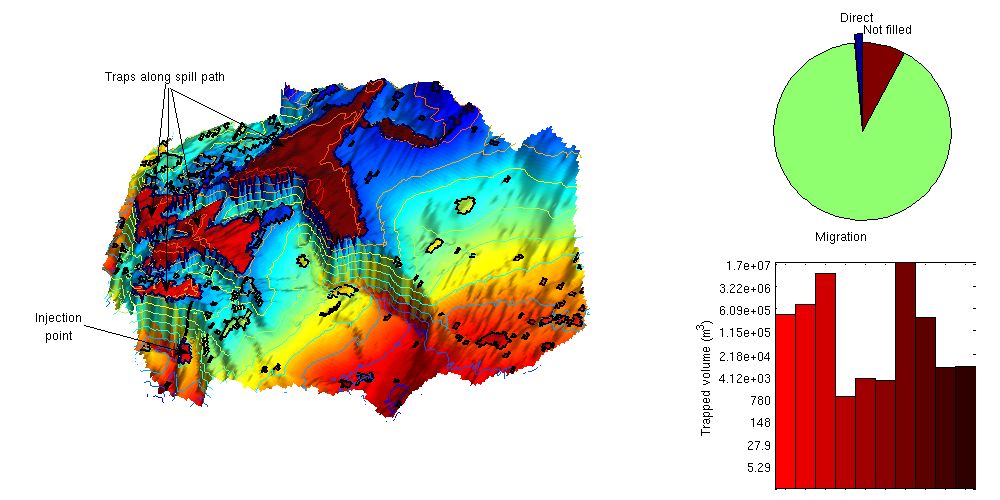
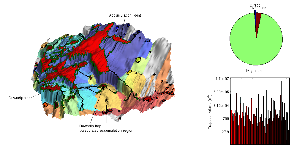
How the plume will migrate in the upslope direction is one of the key questions when injecting CO2 into a saline aquifer. Much insight about the migration patterns can be obtained by identifying structural traps, computing spill paths, and delinating the top surface of the aquifer into catchment areas associated with unique accumulation points that either are inside a structural trap or or the perimeter of the aquifer. In MRST-co2lab this is referred to as a trap and spill-point analysis. To maximize the utilization of structural trapping capacity, it is therefore natural to either place an injection points inside a catchment areas that is connected to a succession of traps having a significant volume, or on the border between two catchment  areas that both are connected to a significant trap volume.

Identifying traps and their associated catchment areas is computationally inexpensive and can be done within a few seconds even for large, high-resolution models. MRST-co2lab therefore offers an interactive viewer that combines tools for trap and spill-point analysis and simple vertical equilibrium simulation to simplify the process of identifying structural traps and their connection and using this information to identify good candidates for potential injection sites. Figures 1 and 2 show how this viewer has been used to analyse the Johansen formation based on depth and thickness data from the North Sea CO2 Storage Atlas.

Figure 1: Interactive trapping tool in forward mode (left mouse button): The left plot shows depth of the top surface with structural traps along a spill path identified in red color. The pie chart shows volumes of the marked trap (direct volume), traps along the migration path (migration volume), as well as traps not filled. The bar plot shows volumes of all individual traps along the migration path.


Figure 2: Interactive trapping tool in backward mode (middle mouse button): The left plot shows the top surface in which all downdip traps of an accumulation point have been colored in red, and the accumulation region of each individual structural traps in the formation have been given a unique color. Here, gray signifies areas that have no trap in the upslope direction.

The viewer can be invoked in two different ways by either specifying a top-surface grid as input or the name of one of the formations from the North Sea CO2 Storage Atlas. (Three different examples of how this viewer can be set up are found in this tutorial). In default mode, the viewer will start up by showing a 3D plot of the top surface colored according to depth and with traps colored according to volume. For formations from the CO2 Storage Atlas, the suface will also be contoured as shown in Figure 1. In addition, there are toggle buttons that enable you to turn on/off 3D light, contour lines, and visualization of traps and catchment areas.

Exploring traps and spill paths

Left mouse button The user can select any point on the top surface to compute the forward migration path emanating from this point. The 3D display will change so that it marks the spill path (i.e., the path of an infinitesimal trickle of CO2) and all traps encountered along this path to the top of the formation, which is either inside the topmost structural trap or at the perimeter of the aquifer, see Figure 1. In addition, the forward mode will bring up a bar plot that shows the volumes of the succession of structural traps found along the spill path, as well as a pie chart that shows the volume of the trap associated with the catchment area, the volume of the can be reached further up along the spill path, and the volume of traps that are not connected by a spill path from the current injection point.
Middle mouse button The user can select any point on the top surface to compute the backward migration tree emanating from this point, see Figure 2. This backward migration tree is defined as the collection of spill paths from all downslope traps that pass through the trap associated with the catchment area of the selected point. In addition, there is a bar plot showing the volume of all the traps inside the migration tree and a pie chart that shows the volume of the topmost trap, the total volume of all downslope traps, and the volume of all traps that are not part of the migration tree.
Right mouse button The user can select any point on the top surface. If the selected point lies within a cathcment area of a trap, a new window will pop up which shows a zoom of the trap and its catchment area.

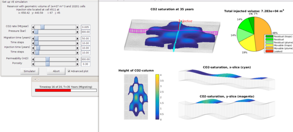
Launching a vertical equilibrium simulation

Once a potential injection point has been selected, the user can click the 'Sim' button to the far right in the menue to bring up a dialogue for setting up a simple  sharp-interface simulation that neither includes compressibility or the effects of residual and solubility trapping. Figure 3 shows a snapshot of a simulation for a highly idealized top surface used as the first example in this tutorial. The setup enables you to set up the injection rate and pressure, the timespans for the injection phase and the subsequent migration phase, the permeability and porosity of the domain, and the number of time steps used to simulate each of the injection and migration phases.

Figure 3: Example of a vertical equilibrium simulation launched from the interactive trapping tool. The visualization shows a 3D view of the CO2 plume, two vertical cross-sections (marked in cyan and magenta color in the 3D plot, an areal view of the height of the CO2 plume, as well as a pie chart showing a detailed trapping inventory. By clicking on this pie chart, you can also bring up a plot of the trapping inventory as a function of time.

Published January 23, 2016