Background
Universal Design is one of four key transport policy targets for the National Transport Plan in Norway. For this reason, the different Transport Agencies (road traffic, rail, costal, and air) have defined their own set of indicators to report on Public Transport Service Design.
On a National level, the National Public Roads Authorities (NPRA) report on 3 main indicators:
- Share of main public transport routes with universal design in the four largest cities
- Share of major public transport nodes with universal design
- Share of ferries of ferry connections on state highways with universal design
Each of the six regions reports to the Public Roads Directorate on these indicators and on their involvement in improvement projects. The Public Roads Directorate, in turn report on a national level.
This was implemented in 2007, and a checklist and a database were developed to report on the indicators. The checklist was based on NPRA guidelines for public transport standards, including Universal Design as well as other quality factors. Most of the existing data was collected in 2007 and 2008, and has not since been updated for several reasons. The data collection task was found to be quite time consuming and some frustration was felt because the data asked for, was not specific enough to allow for comparison between regions. And the rather long checklist needed to be ticked with a positive value for all the components to allow an assessment of a public transport stop or node as being universally designed.
For ferries only a few elements were registered, seating and toilets on board which actually are the responsibility of ferry owners, while NPRA are responsible for land facilities. Generally, ferries scored better than public transport routes and nodes.
Objective
Our task was threefold; to select relevant indicators, to improve data accuracy and simplify data collection procedures, and to present the indicators on a quality scale from 1) inaccessible (very poor quality) to 6) full universal design.

Figure 1: A threefold task of selecting indicators, defining a quality scale for universal design, and revising mapping methodology
Methods
The results are based on the following:
- A literature and document review of other initiatives about indicators, quality scales, and systematic data collection and presentation on accessibility and universal design
- Analysing the current practices and experiences of existing indicator data collections, as well as dissimilarities in collected data, based on reference group meetings and interviews of data collectors
- Clarifying NPRA’s needs for indicators and their use
- A discussion within the reference group on relevant indicators and efficient data collection.
- Review of relevant guidelines and regulations to base requirements on

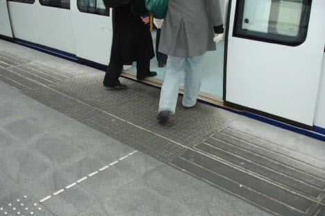
Figure 2: The Copenhagen metro is easy to enter with step free entrance and tactile and visual guidelines
Revised indicators for public transport on roads
It is our perception that an indicator should be a simplified expression reflecting progress on the issue, while not necessarily being based on data thoroughly investigating every aspect of the theme. Although being frustrated with the current data collection forms, there was a clear opposition in the NPRA organization to major alterations in data collection. The people involved did not accept that their invested work may be wasted. This attitude has clearly influenced both the choice of indicators, what data to collect and how the quality scale is designed.
The main purpose of the indicators is to analyse whether investments in physical infrastructure lead to improved Universal Design. To give relevant information, other than an overall score, several elements are included for each of the following barriers; physical barriers, barriers to information and orientation, and barriers concerning allergies and hypersensitivities. And in line with the Total Quality Management Concept applied in the MEDIATE project, some measures on planning, implementation, and evaluation are included. The revised indicators present:
- A quality score 1 – 6 for Universal Design of main public transport routes in the four largest cities (sub-indicators for planning, operation and evaluation, for physical barriers, and for orientation barriers). This is based on data collection about each bus stop along the route, and questions about the quality of planning, operation, and evaluation on route level.
- A quality score 1 – 6 for universal design of major public transport nodes (sub-indicators for physical barriers and for orientation barriers). This is based on data collection about each public transport platform at a node (form as for bus stops), and about the node facilities such as access to the terminal, multimodal public transport information, waiting facilities and accessible toilets etc.
- A quality score 1 – 6 for Universal Design of ferry connections on state highways for ferries and land facilities (physical barriers). Data collection includes data about accessible footways between land facilities and boarding, and accessible footways from the car deck to restaurant and toilets on board.
Easily measured comparable data
Data collection forms are prepared for data to be registered directly on computers when in the field. Each question or element has a set of predefined answer categories (roll down menu), with explanations, for efficient use and to avoid different interpretations. Questions not relevant to the actual site, type of bus stop etc., are hidden. To simplify data collection and provide comparable data, the following choices have been taken:
- Data collection is concentrated on observable physical infrastructure, relevant for tasks identified to be crucial for travelling by public transportation
- The elements included should be easily and efficiently measured, should describe a level of quality, and be easily comparable between sites
This means that all relevant data are not collected. Two examples are as follows: - We collect information on the presence of monitors and loudspeakers for dynamic information, but not on the quality level of the given information
- Although footpaths between essential elements at public transport nodes are certainly important, it is not straight forward how the quality at a smaller station with few footpaths can be compared to large multimodal transport nodes on several levels etc
Since all answer categories are predefined, the results on the 1 - 6 scale can be immediately presented on prepared data presentation spreadsheets for each indicator.
Universal design on a quality scale 1 - 6
To show the results on a scale 1 – 6, a multi criteria analysis is applied. A weight is allocated for each theme, depending on its importance for accessibility and Universal Design. This is combined with set points for each of the possible answer combinations (collected data) for each element. Weight multiplied with points give a score for each element, and a total score for each indicator. This is transformed to the 1 – 6 scale on the basis of actual score compared to total possible score (best case). For each indicator, results are presented for overall assessment, for physical barriers and for orientation barriers. Levels 1 and 2 (red colour) indicate immediate need for action, levels 3 and 4 (yellow colour) indicate improvement potential, and levels 5 and 6 (green colour) indicate acceptable level of Universal Design.
This is an approximate way of expressing a quality level, which may not reflect the actual level at a specific site to full satisfaction, but the direction and pace of development will be reflected. It is also quite a flexible tool, making it possible to compare old and new data sets, incomplete data sets etc. Another advantage is that when regulations change, existing data sets may be assessed with updated weights and points.
Further work
A manual is being prepared to make field data collection more straightforward. In addition plans for testing the spreadsheets for data collection and data presentation in one county (part of a region) are in preparation for this summer. The manual may be updated to reflect these experiences.
Each bus stop, platform, and public transport node etc., needs to have a specific identification to make data transfer possible between different data registers. Further work should include a discussion on the number of routes and nodes to be investigated and how data should be updated and how often. Further development of the indicators should be in the direction of including the full travel chain and making indicators comparable between public transport modes.

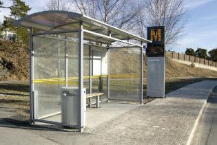
Figure 4: This bus stop has good visual cues and the bus can stop close to the platform

