Interacting with applications without using stylus

This problem stems from the problem area Not using the stylus in the main problem area Interaction mechanisms.

Background

This problem is only applicable for devices that are designed to be used both with and without a stylus (not for devices that only can be controlled using HW keys).
For some users it is not practical to use the stylus. This could be because the user wears gloves, because it too cold to fumble with the stylus, because the user has only one hand available, because the user has lost the stylus, or because the user prefers not using it.

Problem

The most obvious problem that occurs when using the finger instead of a stylus to control a PDA is that the precision when pointing is coarser. Combined with the fact that a finger conceals larger parts of a UI than a stylus does, makes it even more difficult to hit small details using a finger than with a stylus. This problem gets even worse if the user uses gloves of some kind. The most obvious solution, i.e. making the controls bigger easily increase screen space problems.

Solutions approaches

Controlling the PDA using a finger instead of a stylus is partly a question of choosing, partly a question of adapting and partly a question of making UI components (controls). These three levels of solving the problem are proportional regarding cost vs. potential benefits.

Just choosing most appropriate UI components as well as simple adaptation of UI components has no additional costs connected to the components, but may not facilitate an “optimal” solution. By simple adaptation of UI components we mean adjusting the components’ properties to make them more fit for finger use. Exactly which components that work best for finger control vary between the different PDA platforms. For the Windows Mobile platform the following table gives some characteristics of most of the standard components with respect to “finger friendliness”.

Table 3. Different UI components and how they may be adapted to finger use.

Component

Appropriateness for finger navigation

Button

Standard Button size is a bit small, but given a bigger size, Buttons are OK for finger use.

TextBox

For entering text, it is sufficient to click on a TextBox – the rest of the interaction is done through some kind of text entry mechanism. Clicking on a TextBox is feasible using the finger when it has standard size, increasing the size will make it easier. Increasing the height may only be done by increasing the font size (unless it is multiline). Changing the text in the TextBox – e.g. by selecting and changing three characters in the middle of the text – is not trivial using just the fingers. Increasing the font size too much may easily result in a number of other usability problems.

CheckBox

CheckBoxes are not too difficult to operate with fingers, depending on the distance to other UI controls. To trigger a CheckBox, not only the tick box, but the whole control (including the text and any additional space around the text) may be clicked. Given large enough size and distance to other components, CheckBoxes are easy to control using fingers.

RadioButton

RadioButtons have the same characteristics with regards to finger friendliness as CheckBoxes. As RadioButtons always appear in groups, the distance/size requirements are essential.

ListBox / ComboBox

A standard size ListBox/ComboBox is only partly suited for finger use, as both the elements in the list and possible scroll bars are fairly small. Increasing the font size will make the elements in the list larger, but also makes it more likely that there is a need for using scroll bars (that do not increase in size).

ListView

Using icons and LargeIcons as View, ListView may be appropriate to control with fingers.

TreeView

A TreeView is difficult to control using fingers, and it is not possible to make it more appropriate by adjusting its properties.

TabControl

The tabs in a TabControl are not too difficult to operate with fingers, depending a bit on the size. The size of each tab is partly dependent on the length of the text on the tab, and partly on the font size. All tabs should fit on the screen to avoid having to use the scrolling features of the TabControl (which are not easy to operate using fingers). So there is a clear trade-off that needs to be balanced.

ScrollBar

ScrollBars are notoriously difficult to use on a PDA, even with stylus. The ScrollBars size may be increased to enhance their suitability – but then of course leaving less space for other components. Using alternative scrolling mechanisms should be considered as an alternative.

UpDown

In their default size, UpDowns are almost impossible to operate using fingers, and there is no apparent way of adjusting size or fontsize.

TrackBar

TrackBar are not specifically easy to operate using fingers, and there are no obvious ways of adjusting their properties to make them more suited.

MenuItem

MenuItems (i.e. members of the pull-up menu on the bottom of the screen) are not too difficult to operate using the finger although the choices are fairly small. There are no ways for the application to change the size of its MenuItems.

ContextMenu

Items in a ContextMenu are the same UI controls as MenuItems in a main menu, and are used in the same way – but triggering a ContextMenu is more difficult than a main menu using the finger, as the user must hit the control to which the ContextMenu is connected.


By advanced adaptation of UI components we mean adaptations that require programming. Typically, this is done by making subclasses of built-in UI controls. Both the possibilities for doing this, the effects it may have, and how difficult it is to do this type of adaptation varies between platforms, development tools and available libraries. When tailoring an existing UI control is an option, this is usually a less expensive effort than implementing a self-made UI control from scratch –depending on how much of the existing functionality that is to be kept.

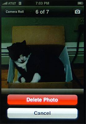
In cases where advanced adaptation of existing components is not possible or feasible for the required custom UI controls, developing custom UI controls is an option. The benefit of doing this is that it will give full control of the appearance and behaviour of the control. The main disadvantage is the costs involved.

Design patterns

There are design patterns for finger friendly interaction for a number of interaction mechanisms, like finger friendly lists, menus, buttons, keyboards, tab folders etc. Here we include finger friendly menu choices as an example of such design patterns.

Finger friendly menu choices

Menu items, both used as part of pull-up menus and context menus are difficult to operate using fingers. An alternative to standard menus is to provide menu choices in a small popup panel at the bottom of the screen, as illustrated in fig. 1 below, showing how this is done in an iPhone application. Similar solutions are applied on HTCs TouchFlo 3D user interface on Windows Mobile.

Fig. 1. Finger friendly menu in photo application on iPhone

Published October 9, 2008