The MRST-GUI module contains advanced plotting functionality with a focus on interactivity. Although the module contains several components used in for example the CO2-lab and the diagnostics module to create interactive figures, this page specifically showcases plotToolbar. The purpose of plotToolbar is to be an drop-in replacement for plotCellData that supports exactly the same syntax, but has added interactive features and allows for more complex datasets to be plotted.
Basic features of plotToolbar
This table lists some of the buttons on the plotToolbar interface along with a brief description of what it does.
Transformation: Exponentiate current dataset.
Transformation: Plot absolute value of dataset.
Transformation: 10 logarithm of dataset. Works by sign(x)*log10(abs(x)) so negative values are allowed.
Filter nonzero values. Note that this function is relatively strict on what it considers zero values, so you may need to threshold values before plotting.
Plot a outlined and transparent grid. Useful when visualizing internal subsets of cells.
Histogram. Plots a dynamic histogram of current dataset. Left click plots data belonging to a bin, right click adds bin to current selection and middle click plots all data expect data belonging to that bin.
Set limits on dataset. Can set limits on multiple datasets at the same time.
Visualize dataset on the equivialent logical grid. Useful for debugging complex geometries.
Subdivide model into two. Click twice to slice model. Hold ctrl to add new slice to existing slice.
Add an interactive slicing plane with a seperate control. Can be moved up/down and through the model. Uses centroids and a threshold to filter.
Change patch properties. Set color/alpha for edges and faces.
Set axis to tight.
Clear subselection. Resets view to the full model and removes any transformations.
If the dataset has 2/3 columns, depending on grid dimension, this will interpret the current data as cell-wise vectors and plot them using arrows. Button appears when applicable.
Lock colorbar. Useful when visualizing timesteps.
Filter based on logical indices, e.g. specific layers or ij-regions.
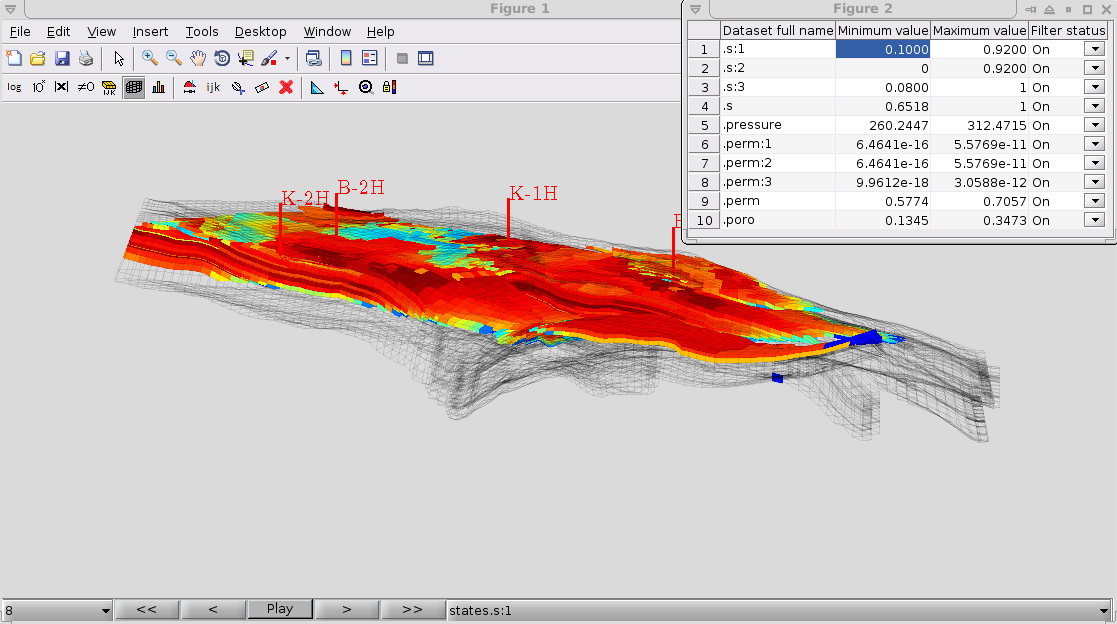
Visualizing timesteps and complex datasets
The standard MRST plotting routines are limited to visualizing a single cell-wise dataset at the time. The more advanced plotToolbar function allows for a greater range of datasets, automatically parsing structs and arrays to find cell-wise datasets. In this example we first plot the saturation as a colormap (cells x 3) dataset corresponding to red, green and blue before we show the oil saturation specifically during several timesteps.
plotToolbar in general handles struct arrays and matrices, interpreting a vector of structs as seperate timesteps and each column of a matrix as a seperate dataset. In this example, the dataset is a struct array with the field .s corresponding to a matrix where the columns are the saturations for each phase.
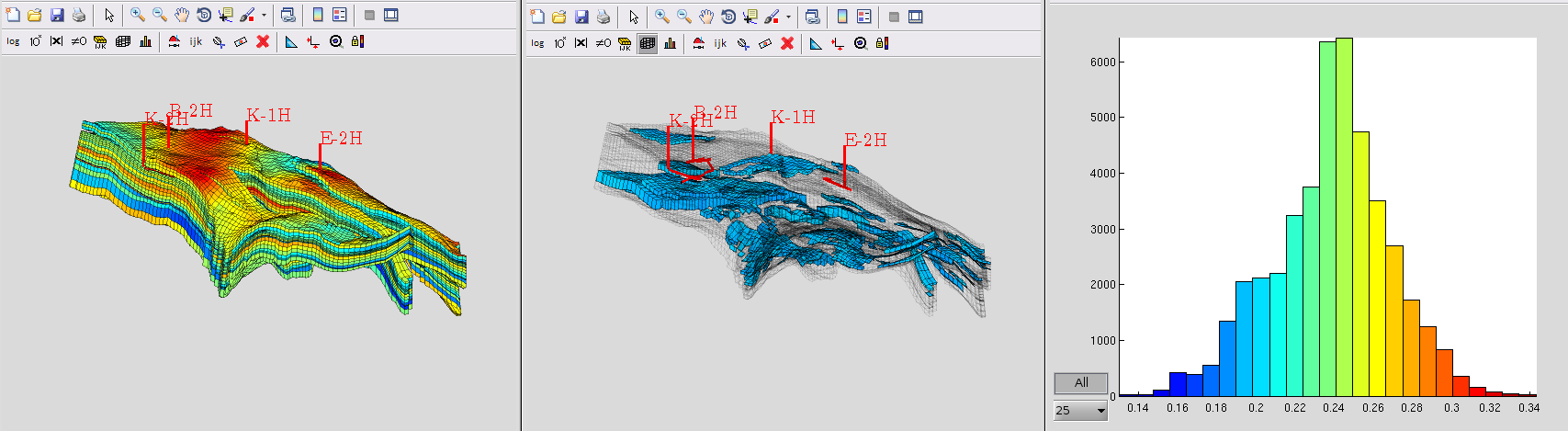
Dynamic histogram filtering
The plotToolbar function includes several ways of dynamically filtering the plotted figure based on various grid properties. Here we consider a simple plot of the rock porosity on the Norne field model (left) where the values are then binned into the histogram (right) and a subset of low value has been selected for visualization (middle).
The histogram is dynamic, using the correct colorbar and data transformations to show and filter the dataset. In this video we demonstrate the visualization of a few timesteps from a simulation, where the oil saturation changes due to the simulation wells. The histogram updates to reflect this, showing that the oil saturation changes from being relatively uniform to a wider variety because the recovery is not uniform. In this video we have excluded the zero values to avoid the plot being dominated by water saturated cells.
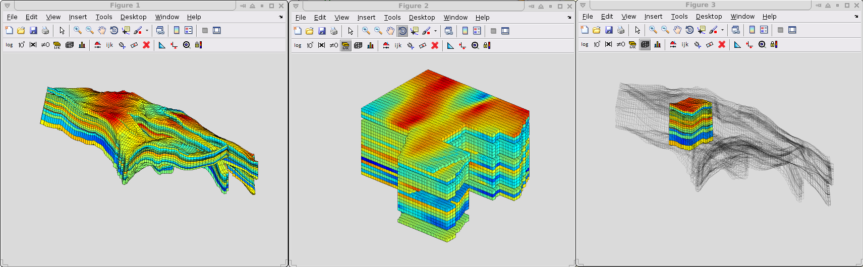
Visualization using logical indices
MRST uses a fully unstructured grid format, but when logical (ijk-space) grid information is available it can be useful for visualization. This figure demonstrates a simple porosity plot, shown both on the actual grid geometry (left), on the equivialent IJK-grid (middle) and limited to a smaller IJK-subset forming a cube (right). All these features are fully interchangable and can be reached directly through the GUI in plotToolbar.
Filtering of values
Since plotToolbar supports plotting of multiple datasets, it is easy to filter on multiple criterions at the same time. For instance, showing the porosity in a region where the oil saturation is high is straightforward and supports standard MATLAB syntax.
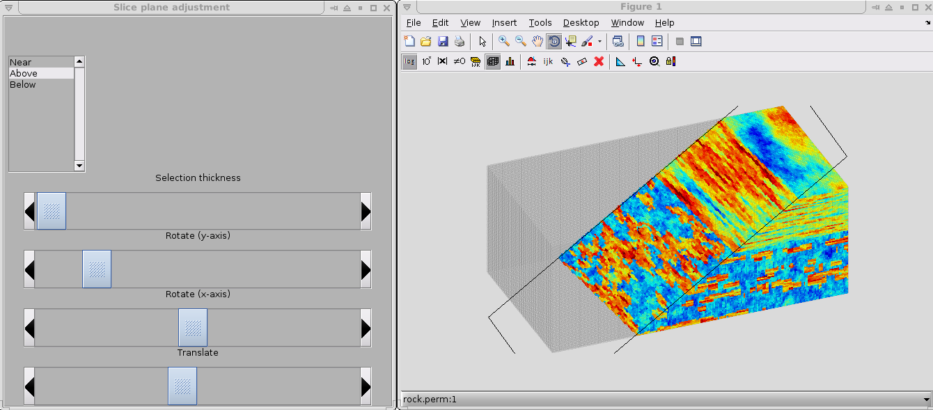
Geometrical slicing
plotToolbar includes slicing planes and utilities for visualizing internal features of any MRST grid. The slicing planes can be combined with all the other filtering features to make it easy to find special regions of interest. In the below figure, a plane is used to examine the internal permeability structure of the full SPE10 test case (~1.1 million cells).